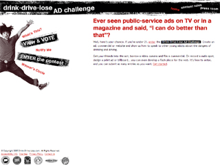
Some of you might find it hard to believe, but I began working with adaptive layouts way back in 2005. I was working on project for the Connecticut Department of Transportation and my primary design made heavy use of fixed positioning and white space. Sadly this is the only screenshot I have of the now-defunct project:

The layout really started to break down on smaller screens—we had quite a few 800x600 monitors to deal with back in the day—so, inspired by Joe Clark’s A List Apart article “Big, Stark & Chunky,” I created an alternate stylesheet that rearranged the page layout, enlarged the text, and improved the reading experience. Sadly, I don’t have a screenshot of what that looked like, but here’s a decent approximation (sans background images), courtesy of the Wayback Machine:

We didn’t have media queries in those days, so I relied on JavaScript to do the stylesheet switching. It was pretty good work for the time, but I see a ton of things I would do differently if I had the opportunity to revisit it.
So why am I bringing this up? Well, I remembered Joe’s article the other day and was thinking about how relevant it is in this, the age of responsive design. I think the idea of high-contrast zoom layouts is incredibly useful, but not just for mobile. When you start to think about the other end of the spectrum—giant high-definition televisions sitting 8-10 feet from your face—zoom layouts become really useful again.
To that end, I have been thinking quite a bit about the viewport-based units available to us in modern browsers and how we can use them to create automated zoom layouts by simply increasing the font size of the body element. Consider this bit of code:
We had issues producing the response to your request.
Sorry about that. Please try refreshing and contact us if the problem persists.
This tiny bit of CSS can ensure that the entire layout is proportionately scaled up based on the screen size being used to access it. To figure out how this bit of code would fit best into your own work, use this formula (replace “X” with your max width size in ems):
We had issues producing the response to your request.
Sorry about that. Please try refreshing and contact us if the problem persists.
The site I developed this technique for is not live yet, so I threw together a simple demo on Codepen. Note: Chrome currently requires a forced repaint on window resize to make it shrink or enlarge the layout. Hopefully that bug will be fixed soon.
I’m still feeling my way around this technique, but I am intrigued by the possibilities it holds. What do you think?


Comments
Nice trick, seems quite useful at first glance, but I don’t think I will use it anytime soon, because I’m not sure it is really better for the users.
Using font-sizes tied to the device viewport means you bypass the “root font size” users may have set in their browsers for accessibility reasons.
What counts IMHO is the reading ease given by the viewing angle, which is not tied only to the device size (and viewport of course) but also the viewing distance.
I know device vendors chose viewports that should give almost the same CSS pixel viewing angle everywhere, but they base such choice on viewing distance average values, not necessarily relevant for every one / every use case.
I, for instance, have set my root font size to 24px on my Mac mini plugged to a 52” TV standing 3,5 meters from my couch, but someone else can be closer or farther, and could chose to keep the default 16px or go further with 32px or even more.
I am currently working on a talk I’ll give at Paris Web next month on the “em” unit, so I try to forge a strong (maybe to strong!) opinion about it and its alternatives, and how they let users control how they want to access content. I’d be happy to discuss more on this “zoom layouts”.
I would actually agree with the em or % method because it is more fluid and adjusts to the individual settings of browsers etc., have a fixed setting like px is to rigid and not responsive at all.
Very slick! I was attempting to employ a similar text scaling method in the grid system I built ( https://github.com/keithparent/TransParent-Grid) using rem with a px fallback, but I’m not very happy with it honestly and this works fantastically - although I haven’t checked it out in any browser other than Chrome and I’m sure there would need to be some amount of varying implementation to fully support the usual offenders. Regardless, great direction/solution and fantastic possibility to pursue.
@martin: This setup assumes everything is set to a fluid (%-based) width with an em-based max-width (to maintain a usable line length).
As a follow-on to this post, I have created a “couch mode” script that lets a user toggle this behavior on and off and it also manages the math for you: easyCouchMode.js (demo).