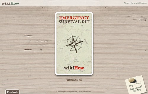
Yesterday saw the launch of the Chrome App Store and, along with it, a Chrome app we created called the wikiHow Survival Kit (also available as a web app).

When we were approached to work on this project several months ago, the specs for the creation of a Chrome app were vague at best. We really had no idea what made a “Chrome app” different from a run-of-the-mill web app or even an HTML5 app. All we knew was that the rendering and JavaScript engines were the same for Chrome apps and web apps, but that Chrome would offer some additional “benefits” to apps built for it. What they were, however, remained a mystery.
Our client knew they wanted to leverage the bits of HTML5 and CSS3 that Chrome had implemented (and some the Chrome dev team had promised to implement soon, like 3D transforms), but hadn’t really come to any decision on what features would be included, or how the content would be presented. They just knew they wanted it to look amazing.
After throwing around several real-life metaphors, such as page turns and the like, we settled on the idea of dealing content from a magical deck of “survival cards”. Our goal was to do as much of the animation as possible using HTML and CSS, relying on JavaScript only when we absolutely necessary, so we could take advantage of the hardware-accelerated animations Google’s Chrome team promised us would also be available in the browser by the time the app store launched.
In building this app, we ran Chrome through its paces, uncovering a couple new bugs and pushing the limits of the browser. The project incorporates a lot of cutting-edge tech, including: CSS-based transforms, transitions and animations; web fonts; a client side database; HTML5 semantics; onHashChange events; and an application manifest. Many of these technologies are still in their infancy and finding a reliable, stable way to work with them has proven quite a challenge, but I think we managed to pull it off with only a handful of newly-gray hairs between us.
One final issue we ran into was that, when we started this project, you could build and even “compile” a Chrome app, but there was no way to install it because a beta of app store hadn’t even been built yet and was required for installation. We had no way of seeing how a Chrome app would behave differently from a web app. Our questions abounded, but there were few answers to be had. Would there be a location bar? Would there be browser chrome? How would links outside the app function?
We had to bide our time and build the app based on how we thought it would work and hope for the best until the app store was ready and we could actually install the app and test it out. Thankfully, as it turned out, installing the Chrome app didn’t really make it all that different from the web app. The only real difference was that, as a Chrome app, the Survival Kit was given a larger offline cache. Oh, and a smaller tab.
After the announcement and unveiling of the store yesterday, the interwebs were aflutter with opinions about the significance (or lack thereof) of Google’s choice to create such a store. Sure, the creation of a Chrome app was the impetus for this project, but for us the creation process was exactly the same as we’d use with any project: we built an amazing web app. In truth, I wish we’d had the time and budget to make it usable in any modern browser (unfortunately, that was beyond the scope of our contract), but I am encouraged by the fact that it is available on the web as well, which means you can visit it in any other modern Webkit browser.
Daniel will be posting a technical round-up of the project in the coming week and he’ll dig into the details of the project a bit more.


