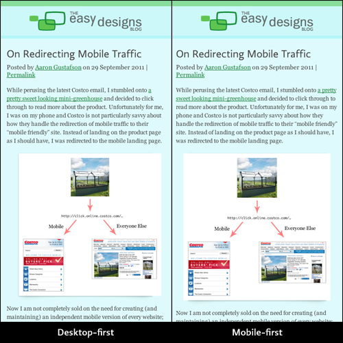
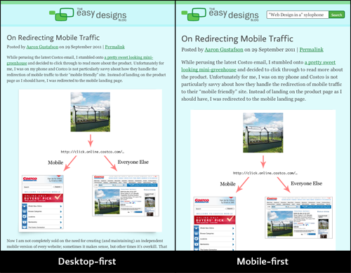
If you’re reading this on a desktop browser, you may not have noticed, but we just turned this blog on it’s head, design-wise. Those of you browsing on a tablet or mobile device, however, should be enjoying a much more comfortable reading experience. Now that’s not to say that we’ve been giving mobile the short end of the stick before pushing out the new code, but our approach to mobile has changed drastically since the redesign of this blog early last year and we’re really happy to be able to bring the lessons we’ve learned back here.
Our initial approach to this site involved building out the desktop view as the default layout. We then used CSS3 media queries to “dumb down” the content by removing some page components and reconfiguring some of the content. It worked pretty well, but we were relying on our mobile users to have media query support in their device. Given that our audience tends to have more capable mobile devices, it probably wasn’t an incorrect assumption, but it wasn’t all that kind to people who happen to have less-capable devices. And, in truth, it didn’t sit well with us because it didn’t really jive with the progressive enhancement philosophy I advocate so hard for. That said, the world of media queries was pretty new at the time.
We know better now.
In the past year, our approach to mobile has become much more nuanced as we embraced the “mobile first” idea Luke Wroblewski has been pushing for (and recently wrote a book about). The idea of “mobile first” is that you optimize your site for use in a mobile context and then layer on additional styles, JavaScript, and content as you find you have more real estate to work with or a more capable device.
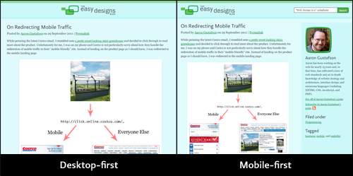
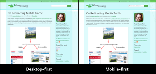
In terms of media queries, it meant switching the layout around to be mobile when media query support was lacking and then making tweaks to the styes as the browser’s width exceeded certain milestones (using min-width values rather than the max-width ones we’d been using previously to skrink the site). On the JavaScript end, it meant witholding certain scripts until we knew they’d be useful (the comment preview, for instance, is terribly distracting on a mobile device). These were techniques we’d already put into practice on other sites, but that we had not gotten around to applying here.
The biggest difference most people will see is the visual one. In its previous incarnation, this site only supported 2 resolutions: wide and narrow. It didn’t matter is you were on a tablet or a handheld device; you were getting the mobile layout. Under the new setup, the layout is far more nuanced, adjusting roughly 6 times. Some of the adjustments are subtle (such as relocation of search from the footer to the header as you cross the 570px mark), but others are more substantial (such as the introduction of sidebar content at 651px). Below are a series of screenshots depicting the differences between the two approaches at different milestones.


Taken altogether, the differences don’t appear that substantial, but given that every device/browser has access to the narrow layout, the reading experience is vastly improved. Note: to get IE to apply media queries in versions 8 and under, we’re using the Scott Jehl’s Respond.js.
So that gives you a pretty good sense of how we’re adjusting the layout based on the device size, but there are a few other niceities going on under the hood that I’d like to share as well. Here’s a round-up:
- Our content images are now being served via src.sencha.io, a free web service and CDN from the folks behind Sencha that takes the pain out of serving images based on the device requesting them. To keep the implementation simple (and easily swappable), I wrote an ExpressionEngine plugin to automatically swap images for their src.sencha.io equivalents (EE1 only for right now, but I’ll port it shortly). For more detail on using src.sencha.io, check out this article.
- Comments are now loaded via Ajax. I know, it sounds crazy, but it makes sense. By default, we include a link to an alternate version of the blog post template with comments exposed (well, really it’s the same template with an additional URL segment passed in). Then, using JavaScript, we look for that link and replace it with the comments thread after the page finishes loading. You know, progressive enhancement. The overall effect is that it reduces the time it takes to download the page, which means you get to the content you want to read faster. You can check out the code that makes it work over on Github (it’s a slightly modified version of Scott Jehl’s original script).
- Our social plugins now protect your privacy. We hadn’t really thought about the fact that every time a script is included from Twitter or Facebook, that can be used to track your movement around the web. Once we realized it though, we decided we needed to change our social links to protect you. As such, we’ve changed the links to work without JavaScript and using images delivered by servers we control. Google+ has been dropped for the time being as they do not seem to offer a consistent destination URL for their +1 service. If they change that or someone can tell us what it is, we’ll likely bring it back.
- Better support for services like Readability. We want you to be comfortable reading our content; if you don’t like our layout, that’s fine with us.
What do you think? Did we miss anything that would make your reding experience better on this blog?
PS - If you’re interested, I’ll be giving a full-day Adaptive Web Design workshop in Amsterdam on 29 November 2011, during which I will be discussing these topics and more in much greater depth and mentoring attendees on how to craft truly rich web experiences with progressive enhancement. Tickets are available on EventBrite.


